Components
Every Jenga component, with its code. Light and dark follow the site's theme.
Actions
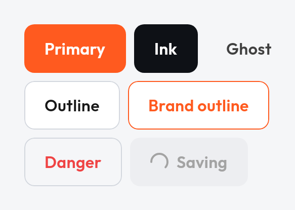
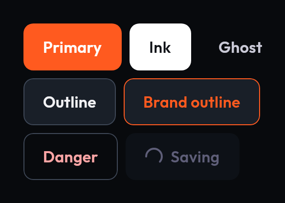 ButtonTriggers an action or event, in seven variants, with a loading state.
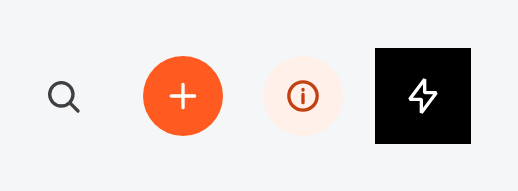
 Icon buttonA compact, icon-only action in several emphases.
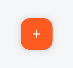
 Floating action buttonA prominent, circular primary action.
 Extended floating action buttonA prominent pill with an icon and a label, when the action needs a word.
 LinkAn inline text action, optionally with a leading icon.

 Info barA button-shaped bar that says why no action is available.
Inputs
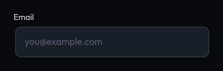 Text fieldA single-line input with label, placeholder and status.
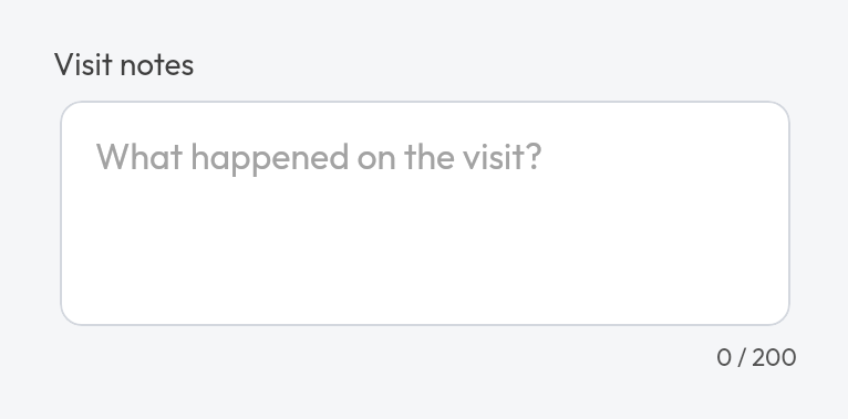
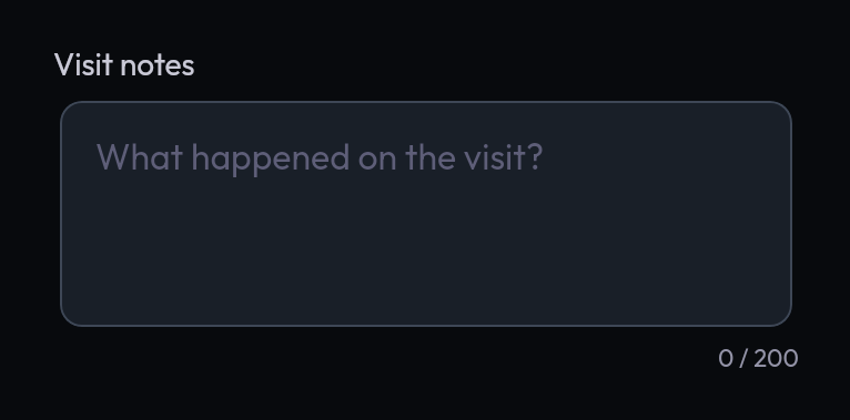 Text areaA multi-line box for comments and notes. Grows as you type, then scrolls; optional character limit with a counter.
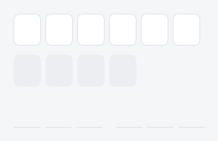
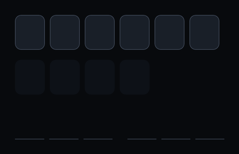 OTP fieldA one-time-code input drawn as cells. Paste, SMS autofill and screen readers treat it as one field.
 OTP resendA countdown that turns into a resend action. The caller owns the time.
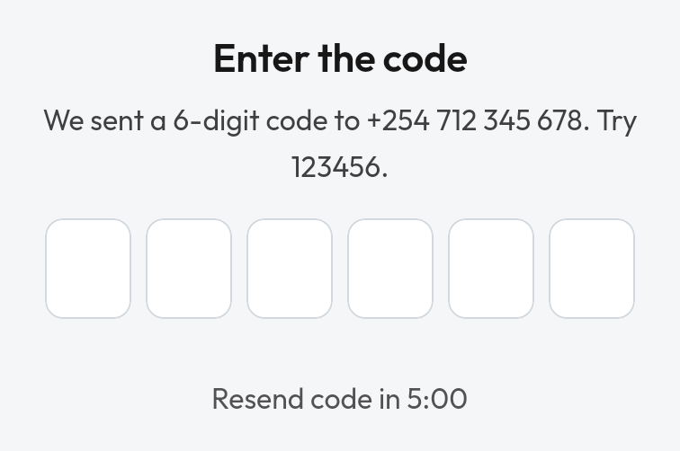
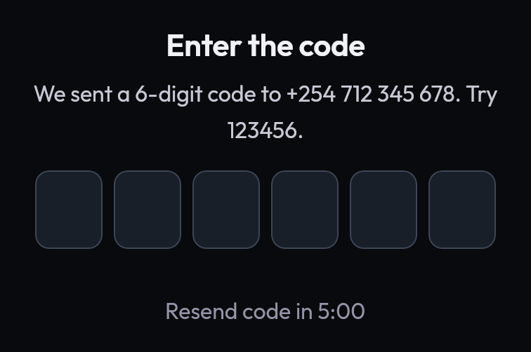 OTP verificationTitle, description, code field, verifying row, resend and actions in one block for screens, sheets and dialogs.
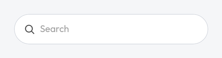
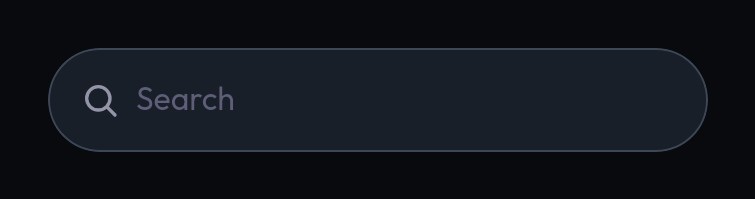 Search fieldA pill-shaped input with a search icon and clear button.
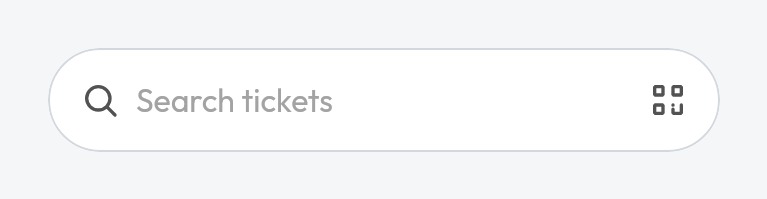
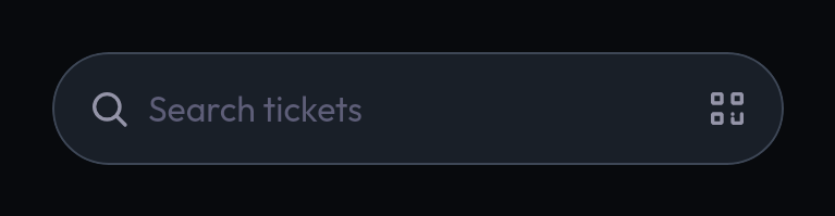 Search triggerLooks like a search field and opens a search screen when tapped.
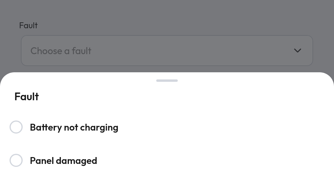
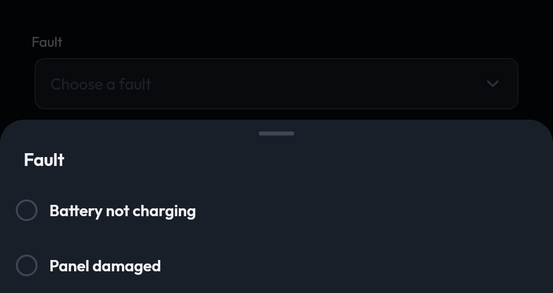 Select fieldShows a chosen value and opens a picker when tapped.
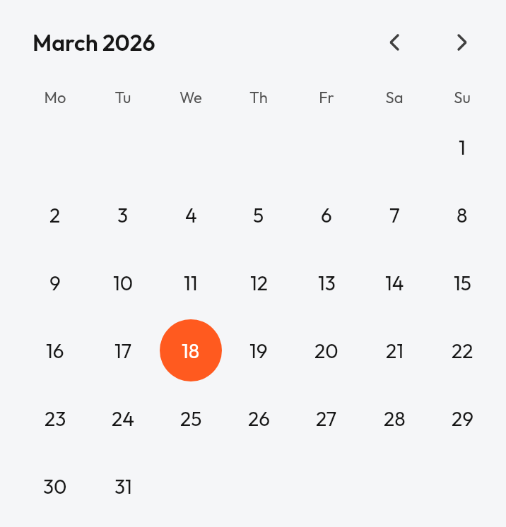
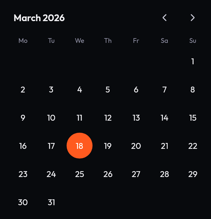 Date pickerA month calendar for picking one date.
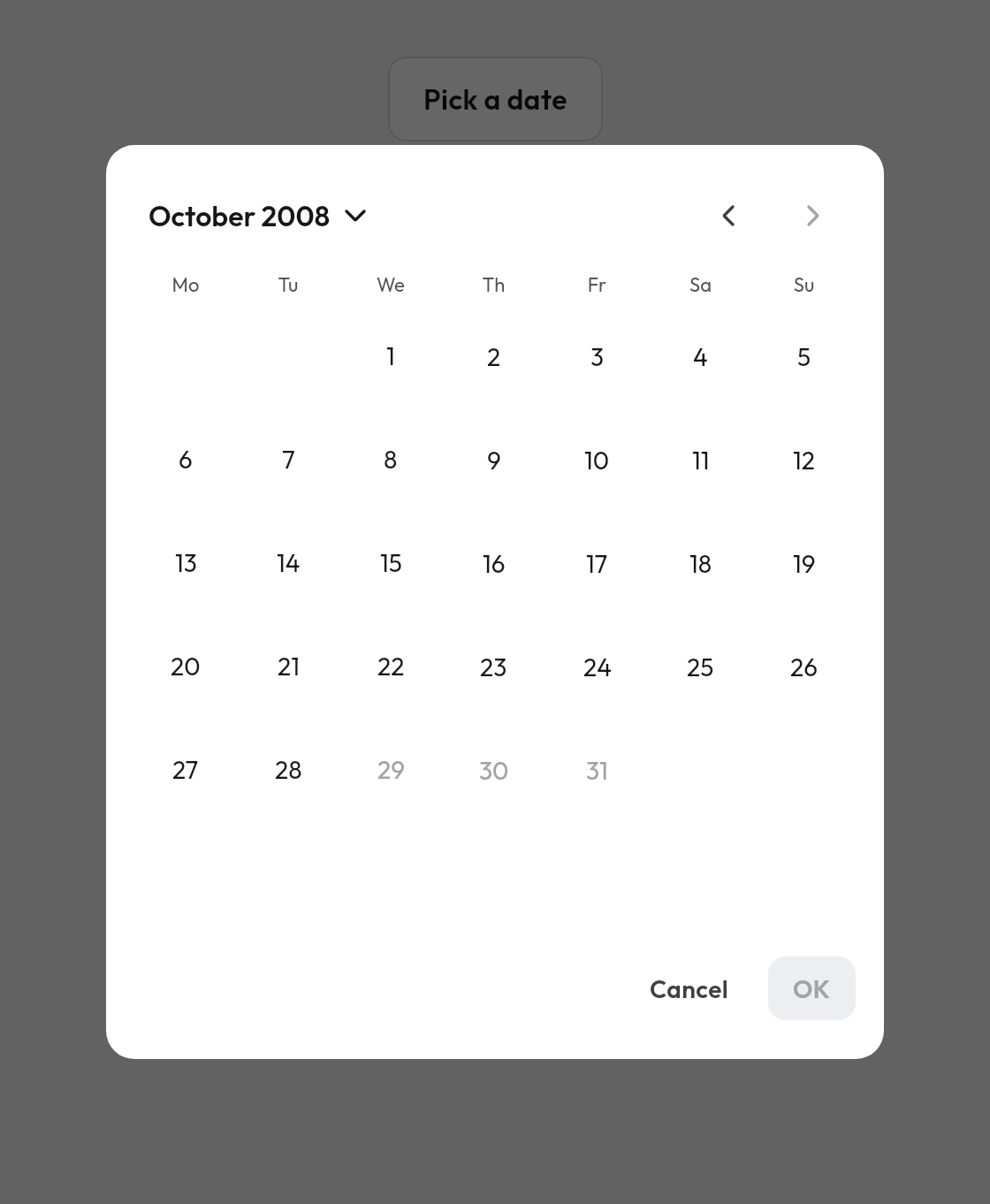
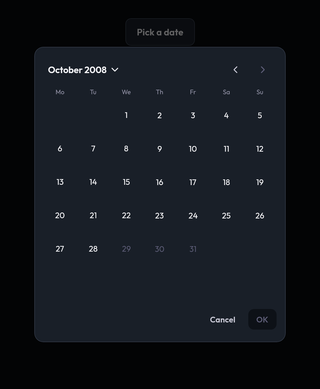 Date picker dialogA date picker in a dialog; here limited to adults' birth dates, with a year grid behind the title.
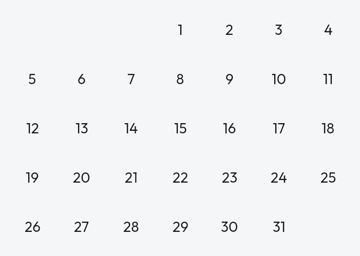
 CalendarA paging month grid where every day cell is your own content.
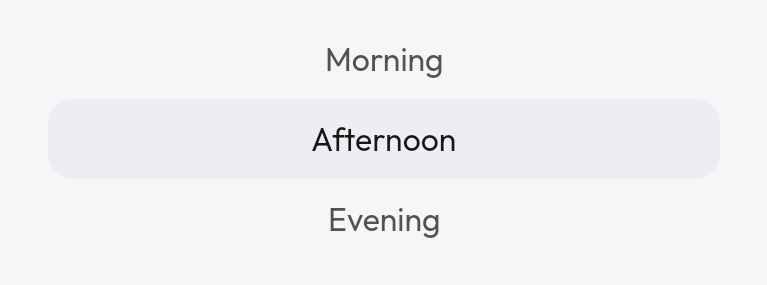
 Wheel pickerA scroll wheel for picking one option.
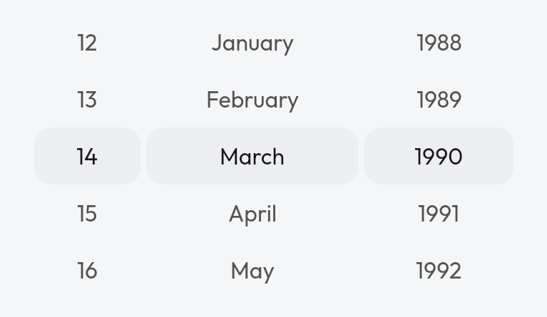
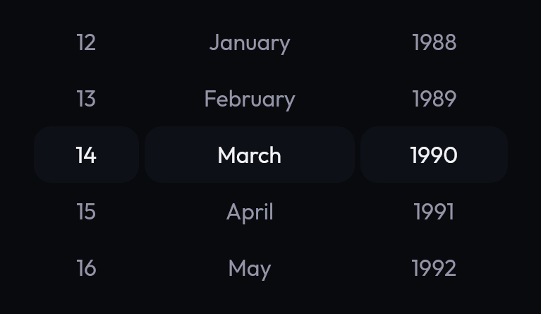 Date of birth pickerDay, month and year wheels for a date of birth.
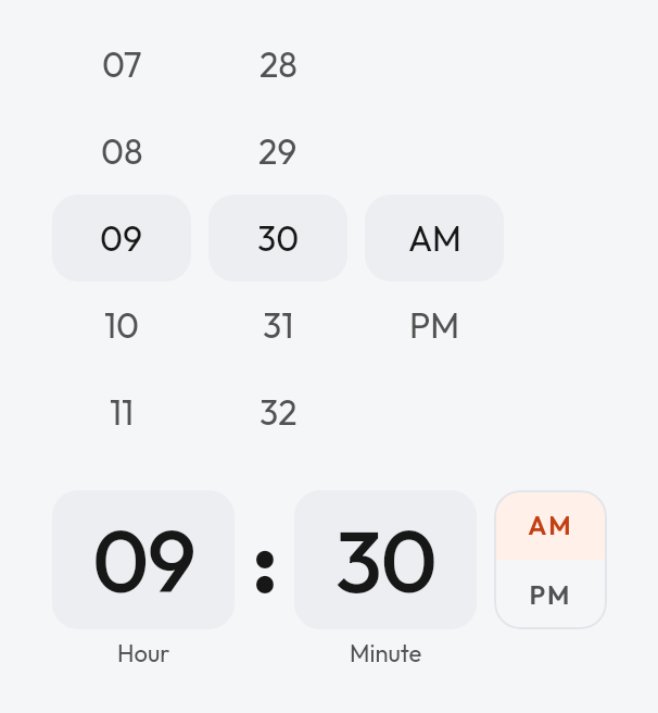
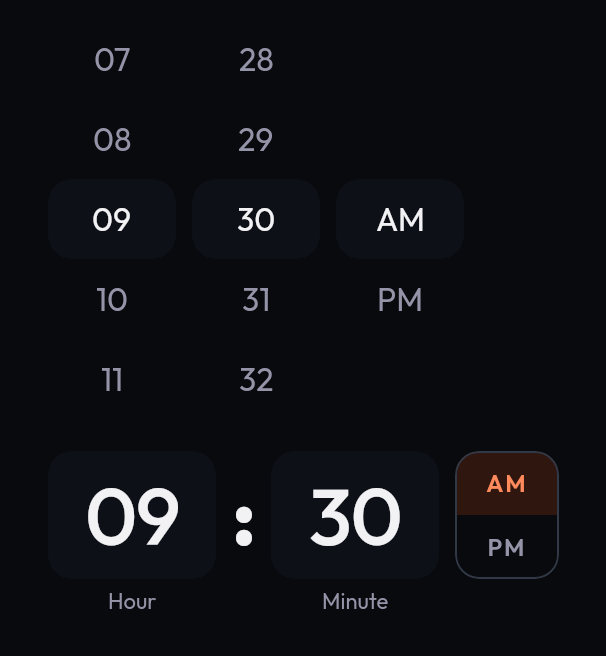 Time inputHour and minute as scroll wheels or typed fields, with AM / PM.
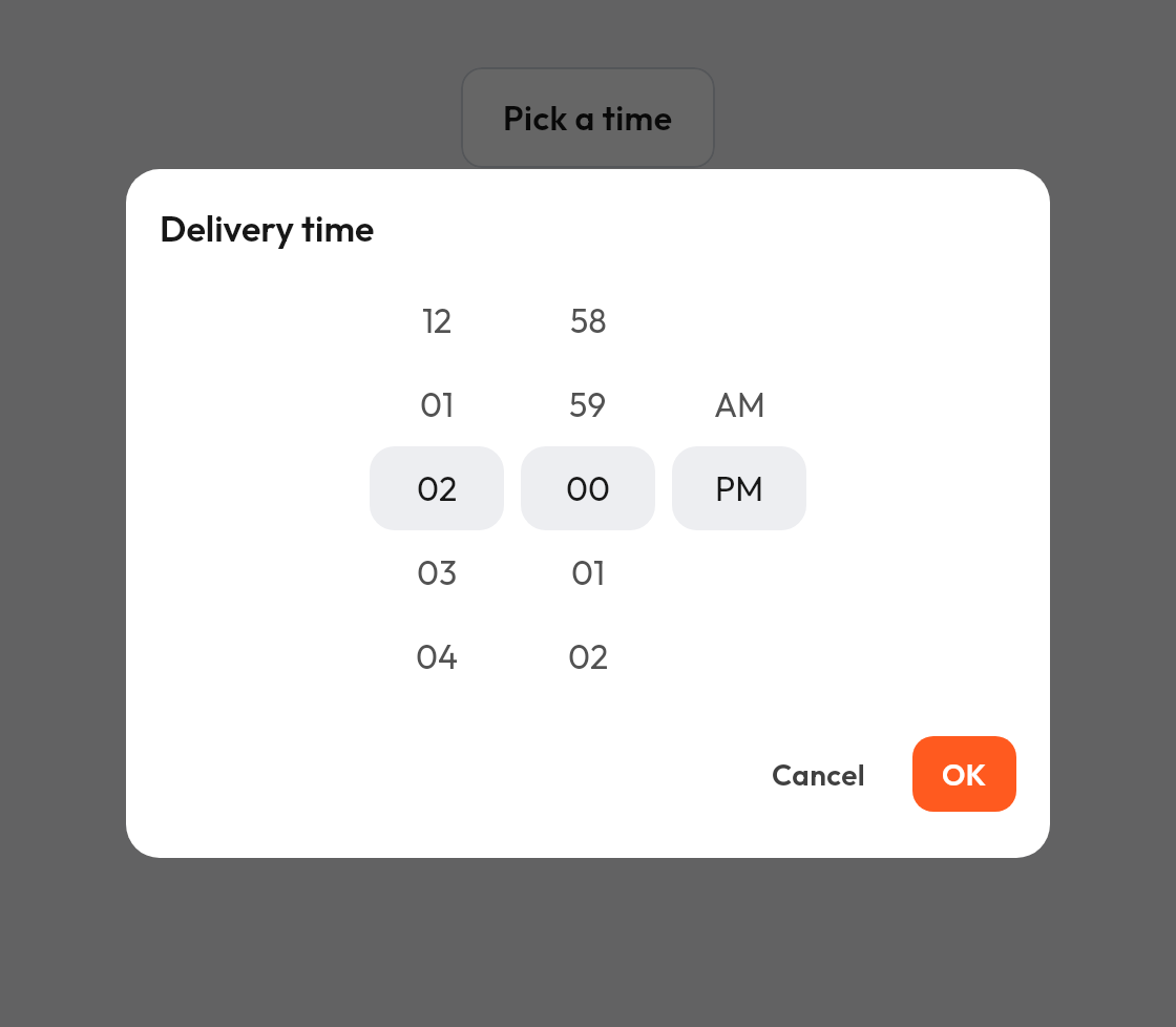
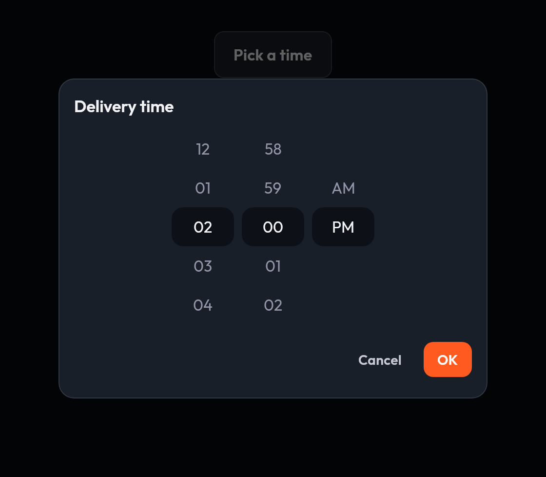 Time picker dialogA time input in a dialog with confirm and dismiss.
Selection

 ToggleA switch for an on or off setting.

 CheckboxA box for a single on or off choice.

 Radio buttonSelects one option from a set.
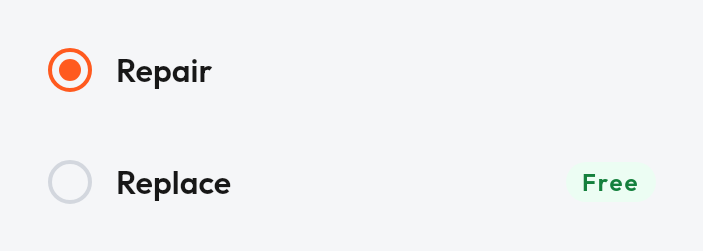
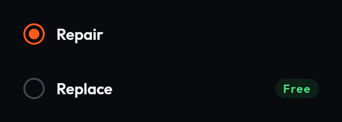 Radio list itemA list row with a radio button, for picking one option.
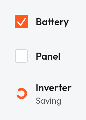
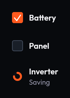 Checkbox list itemA list row with a checkbox, for picking several options.
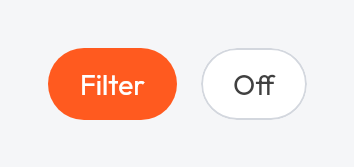
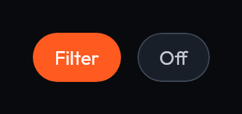 ChipA compact, selectable filter or tag.
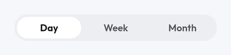
 Segmented controlSwitches between a few mutually exclusive options.
Containers
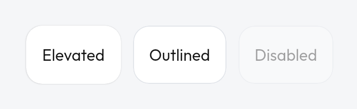
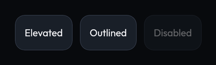 CardA surface for grouped content, elevated or outlined, optionally disabled.
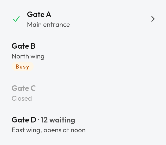
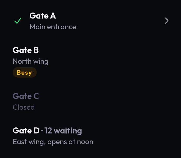 List itemA row with leading, headline, supporting and trailing slots.

 DividerA thin rule that separates content.
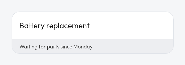
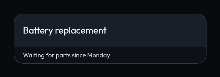 Card footerA quiet strip at the bottom of a card.
Feedback
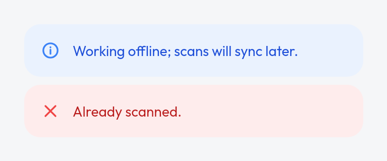
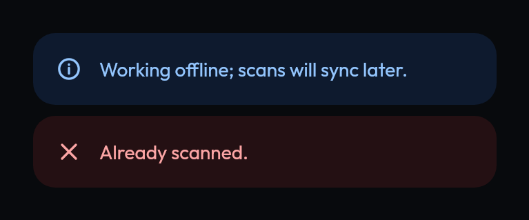 BannerAn inline, tinted message tied to a status.
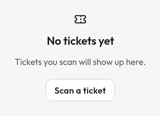
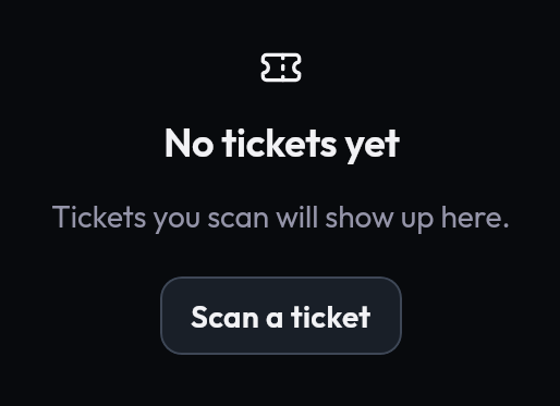 Empty stateA centered message for a screen or list with nothing to show yet.
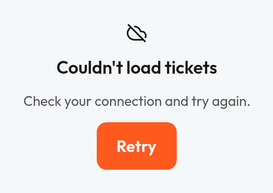
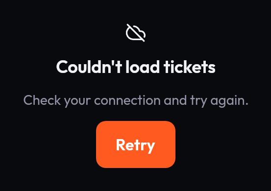 Error stateA centered failure message with a retry action.
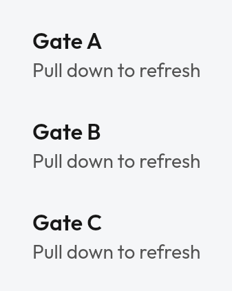
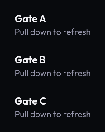 Pull to refreshWraps scrollable content so a downward pull reloads it.
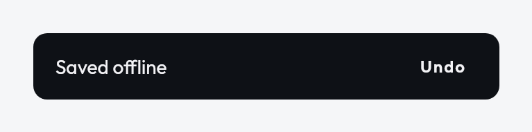
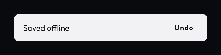 SnackbarA brief message with an optional action.
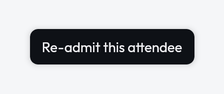
 TooltipA small label that explains an element.
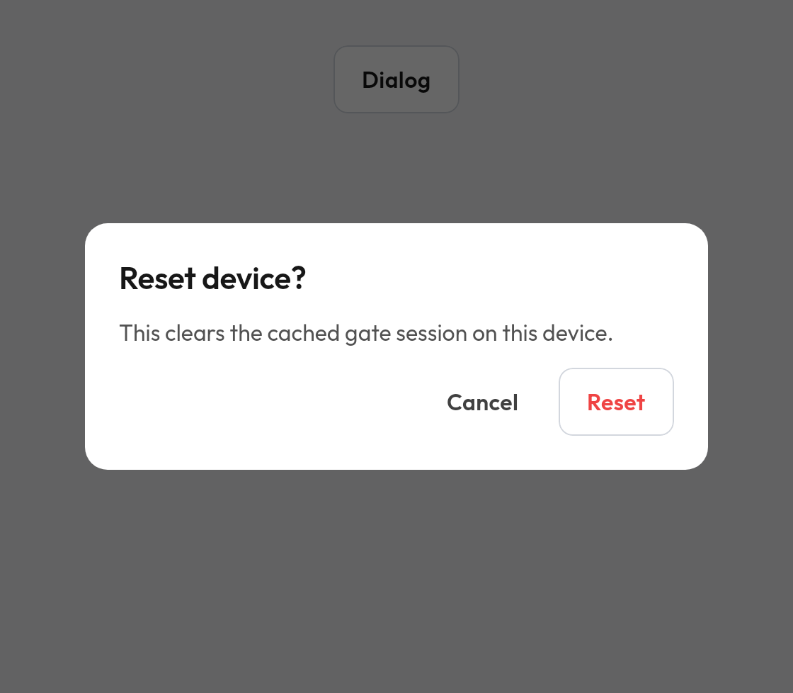
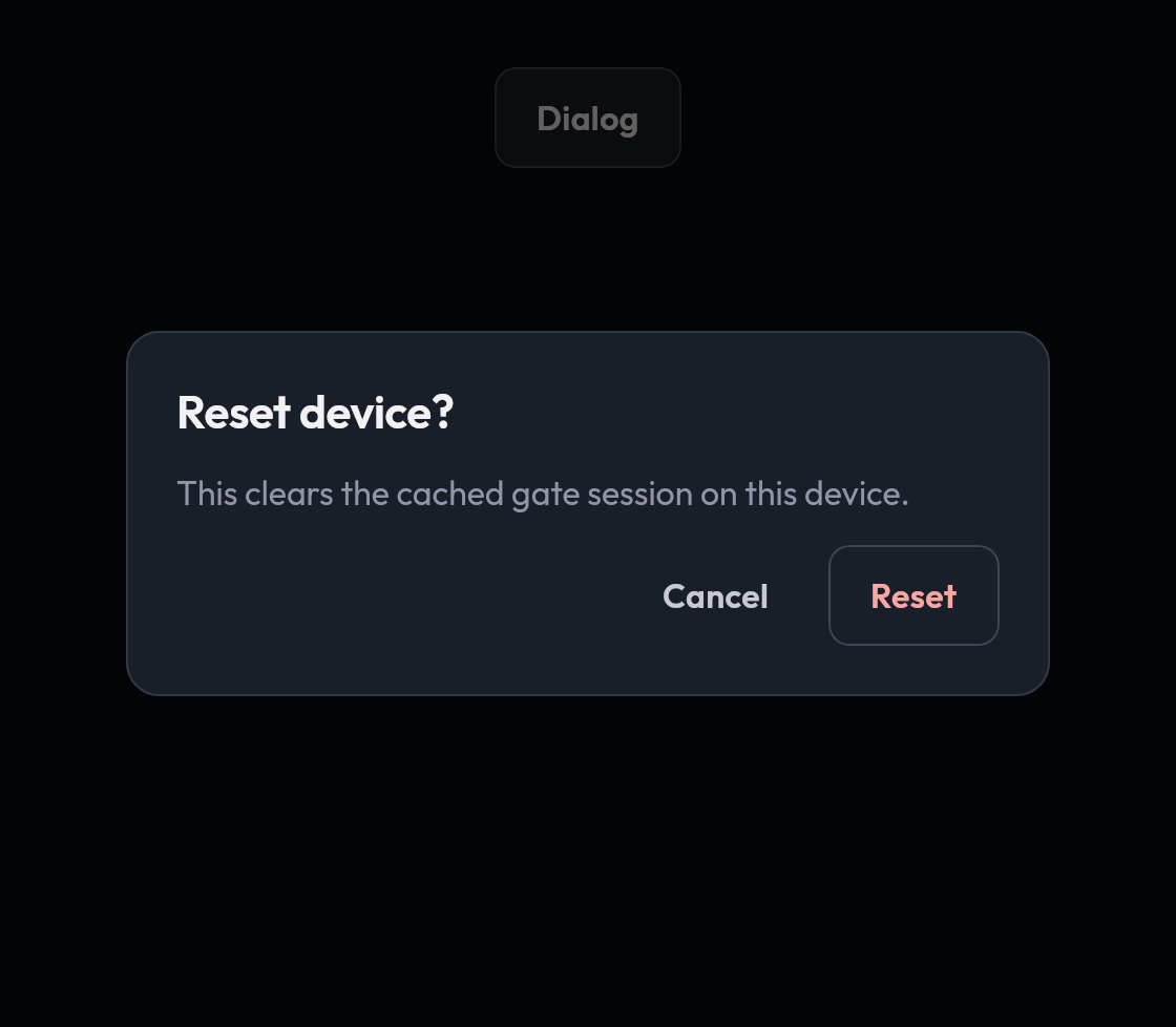 DialogA modal that interrupts for a decision.
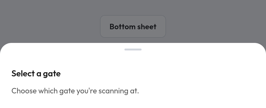
 Bottom sheetA panel that slides up from the bottom edge.
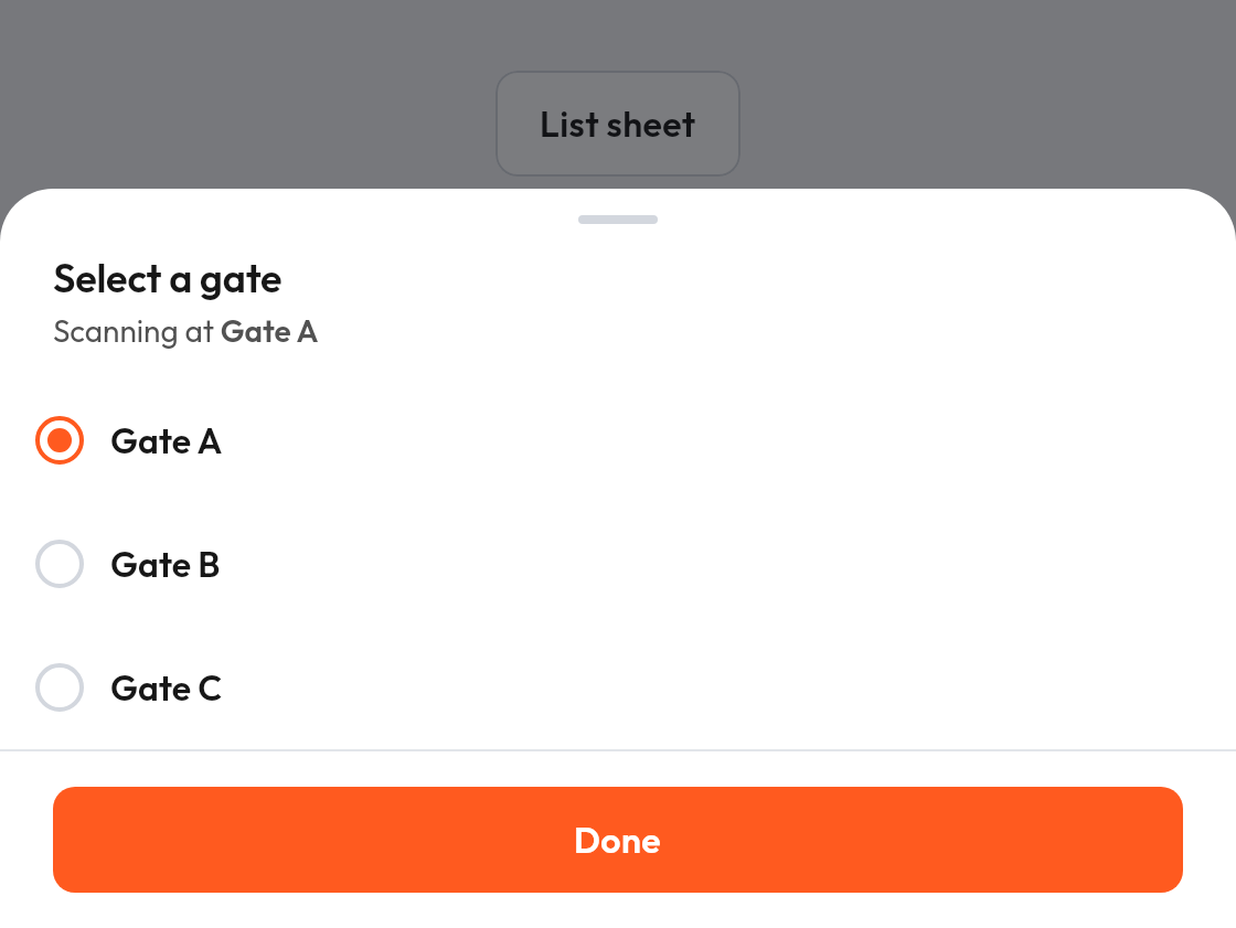
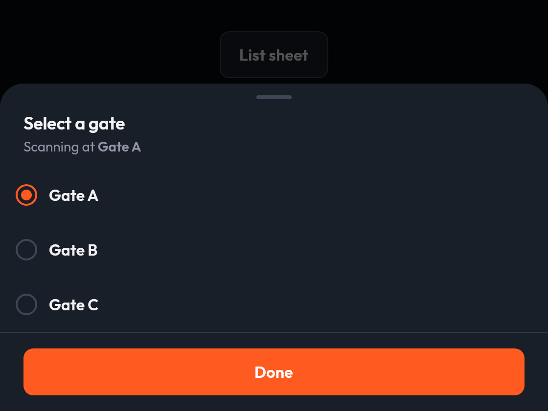 List sheetA bottom sheet with a title, a lazy list body and a pinned footer, for pickers and short forms.
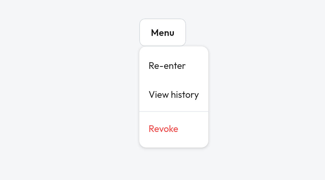
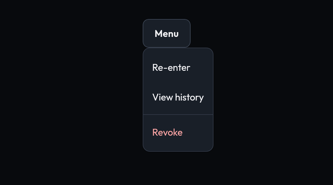 Dropdown menuA list of actions anchored to a trigger.
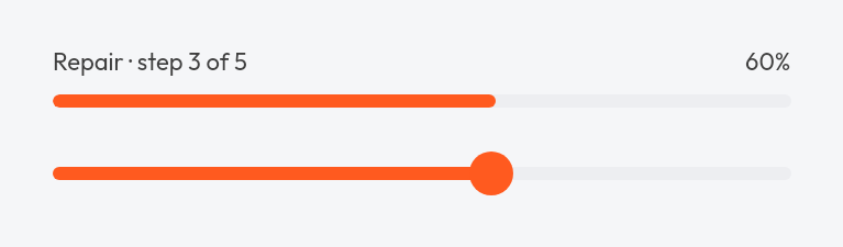
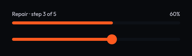 Labelled progressA progress bar with a label row above it.
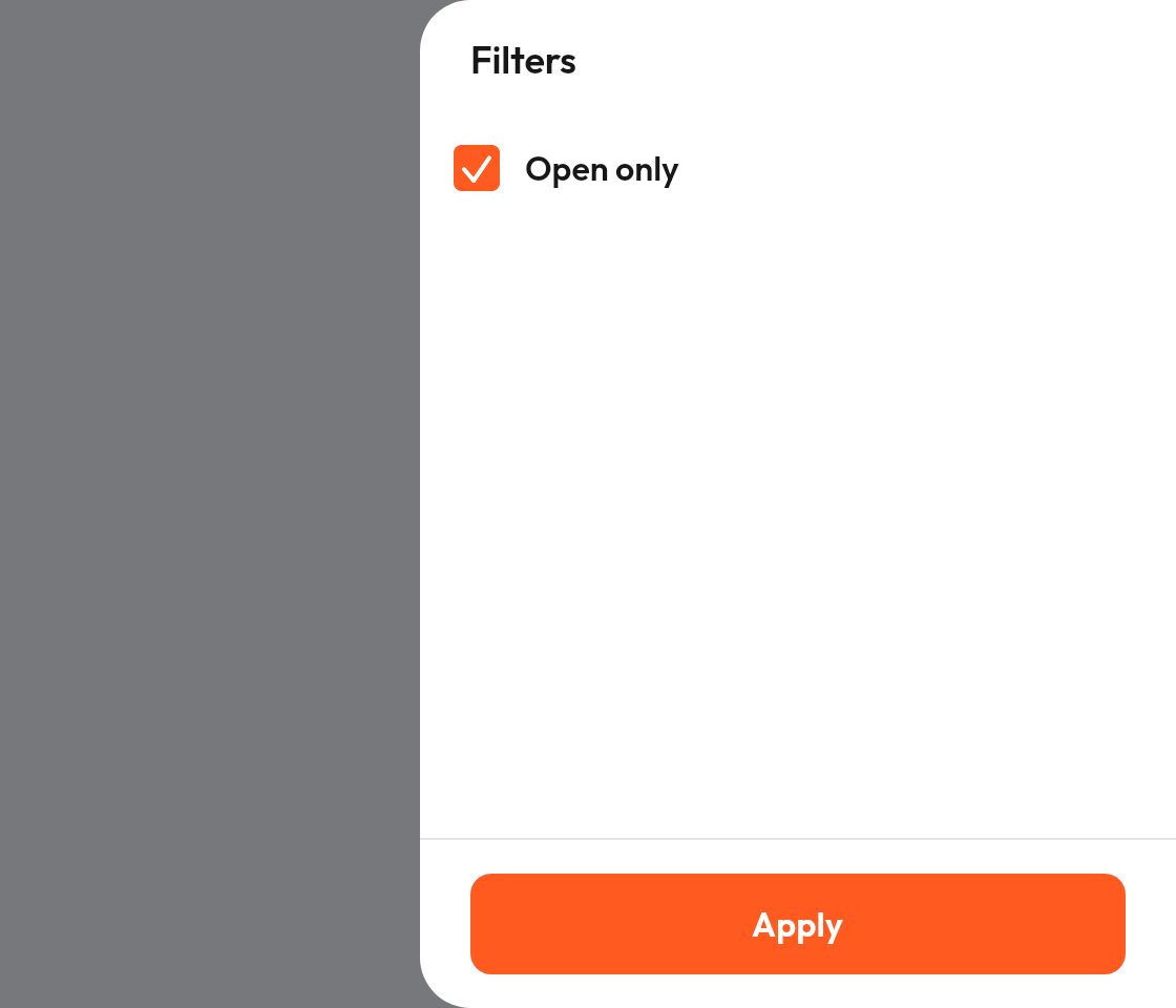
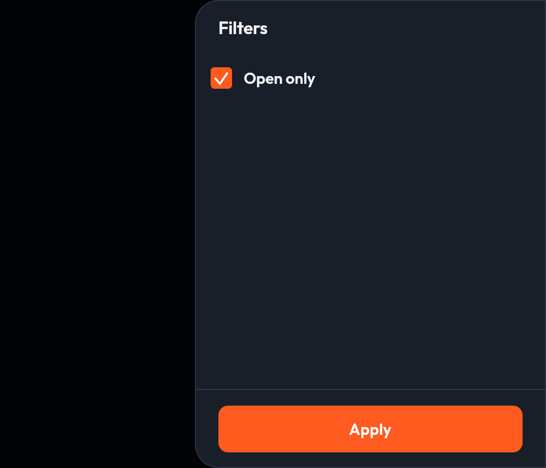 Side sheetA sheet that slides in from the end edge, for wide layouts.
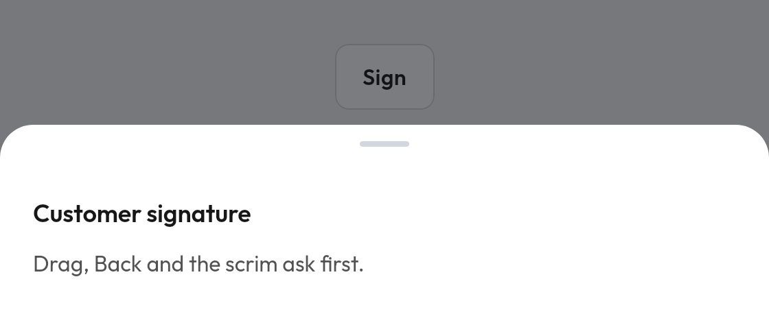
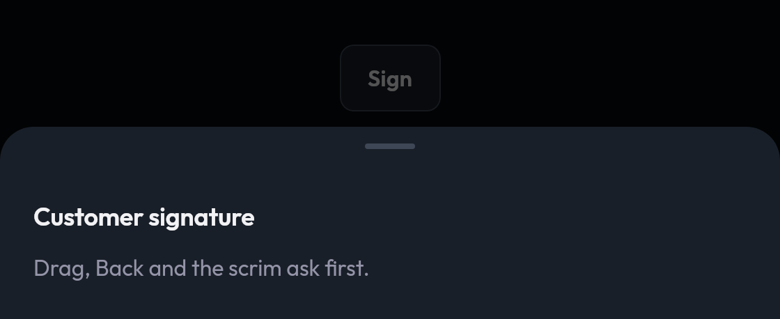 Bottom sheet that asks before closingA sheet that refuses a drag, scrim tap or Back until the user confirms.
 Snackbar hostShows snackbars one at a time from a host state, usually in a scaffold.
Navigation

 TabsSwitches between views with an underline indicator.
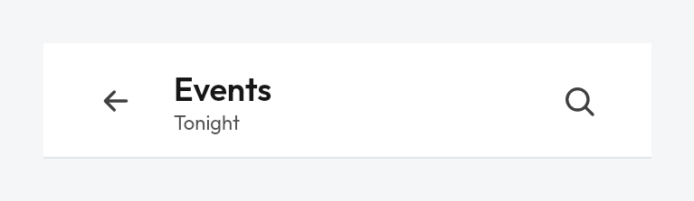
 Top app barA screen title with optional navigation and actions.
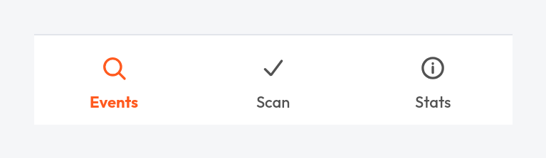
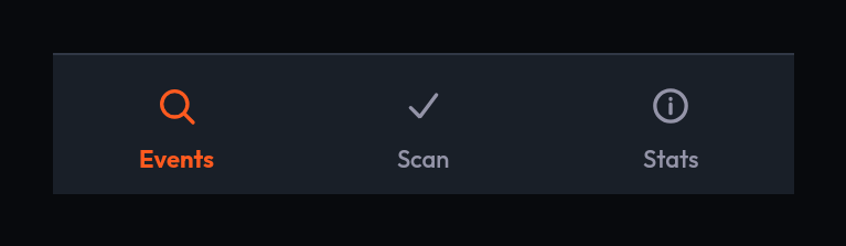 Navigation barTop-level destinations along the bottom edge.
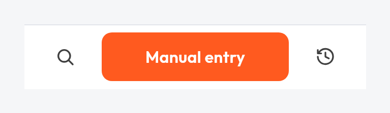
 Bottom barA footer row of actions for the current screen.
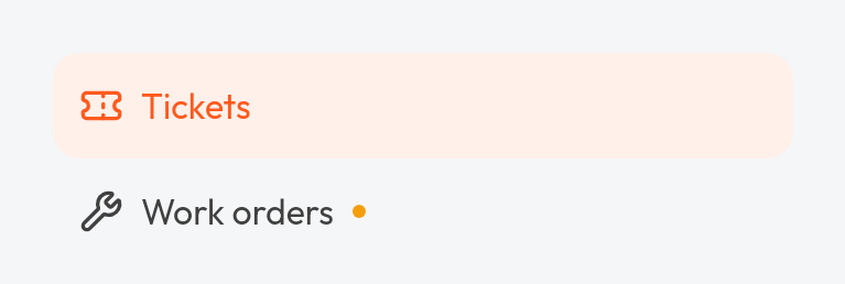
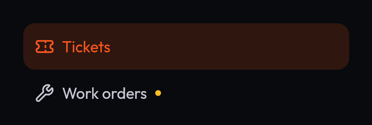 Navigation rail itemA destination row for a side navigation list.
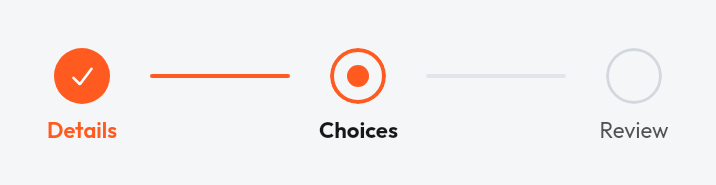
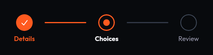 Step indicatorA row of steps for a multi-step flow: done, current, pending or locked.
Data display
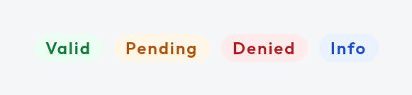
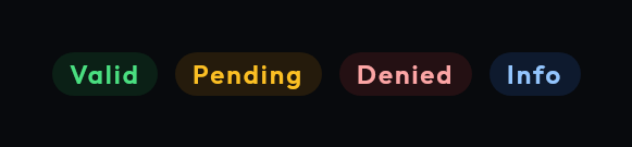 BadgeA small status label in several tones.
 Icon tileAn icon on a tinted rounded square, in each tone.
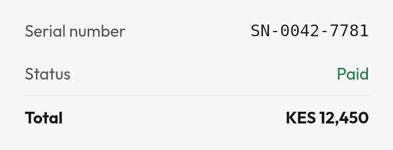
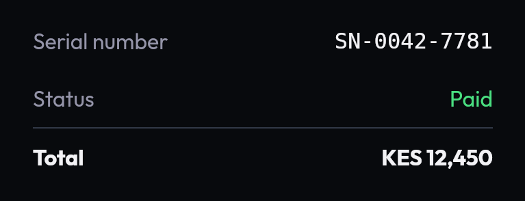 Key value rowA label with an end-aligned value, for detail and summary sections.
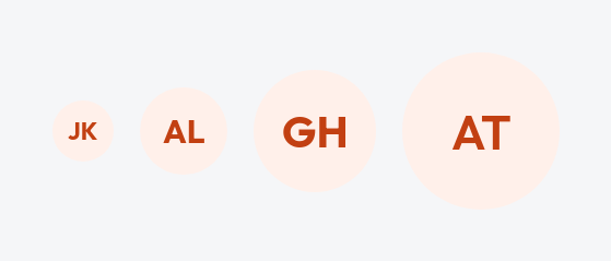
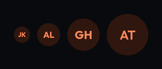 AvatarInitials or an image, in three sizes or a custom diameter.
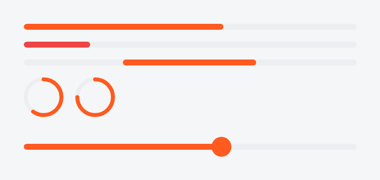
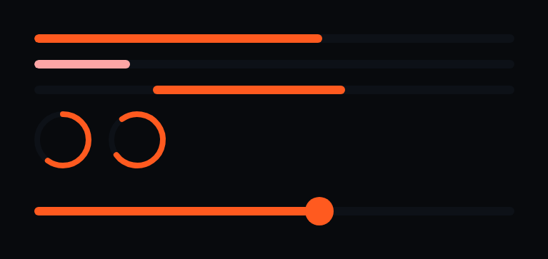 ProgressDeterminate and indeterminate, linear and circular.

 SliderPicks a value from a continuous range.

 ShimmerA loading placeholder that animates.
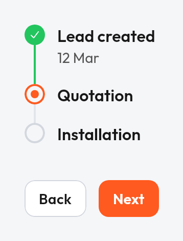
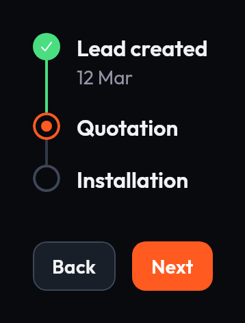 TimelineStages of a process, each marked done, current, stopped or to do.
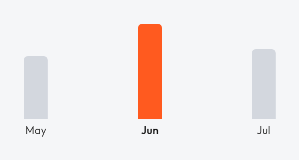
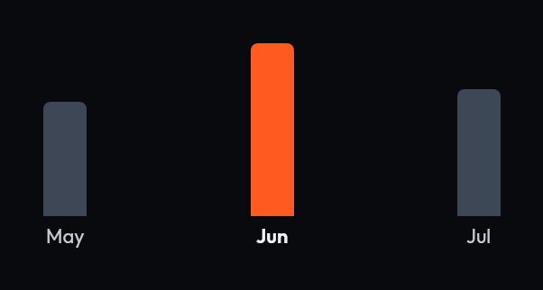 Bar chartVertical bars from a shared baseline, optionally selectable.
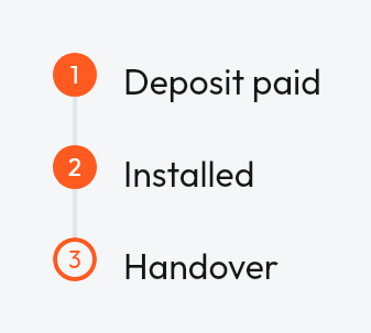
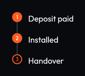 Timeline with your own markersTimeline rows with any marker and any content; positions worked out from the list.
Layout
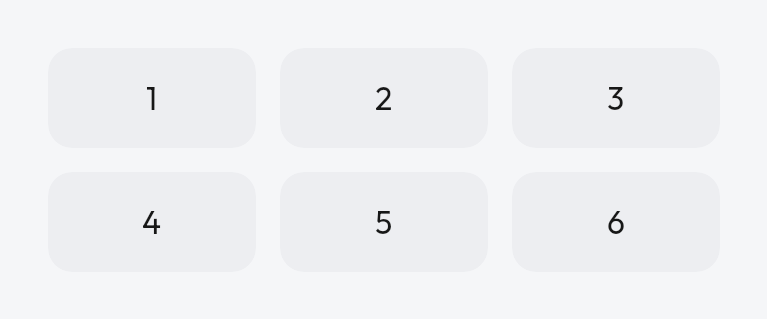
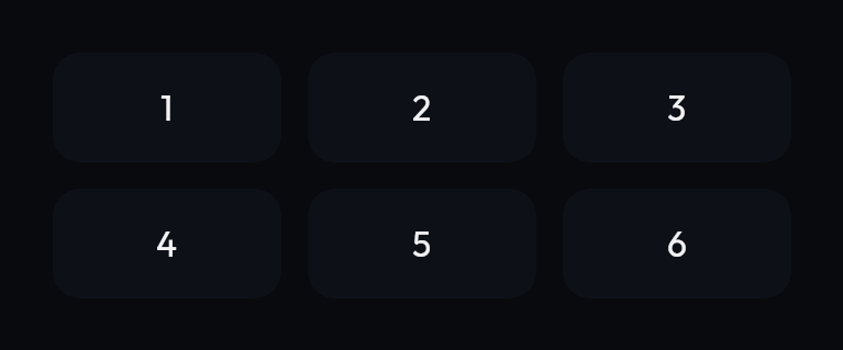 GridArranges children into equal columns.
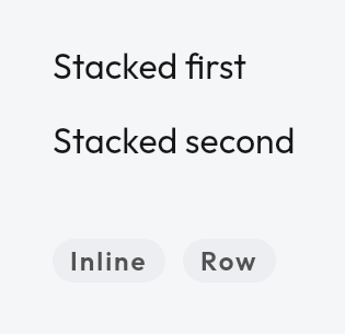
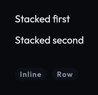 Stack and inlineVertical and horizontal layouts with token spacing, plus a one-off spacer.
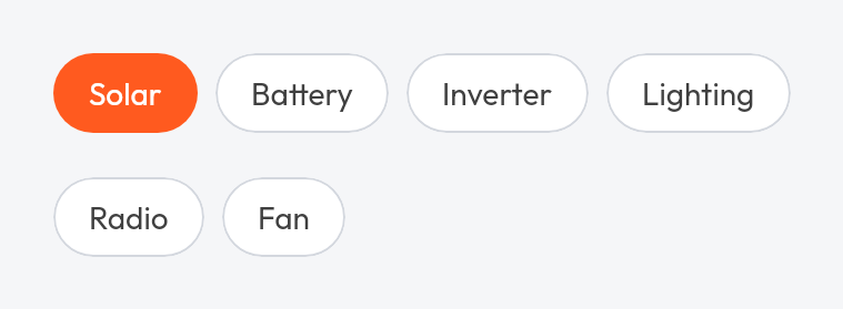
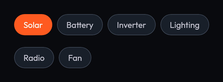 WrapA row that wraps onto new lines when it runs out of width.
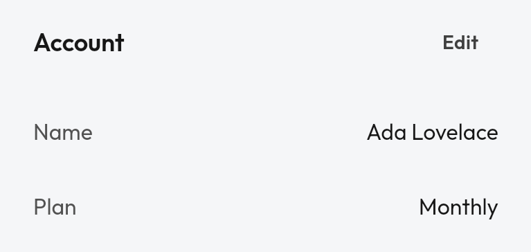
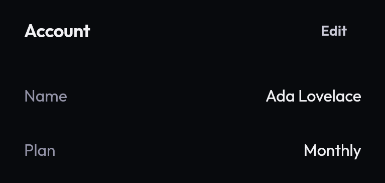 SectionA titled group of content with an optional header action.
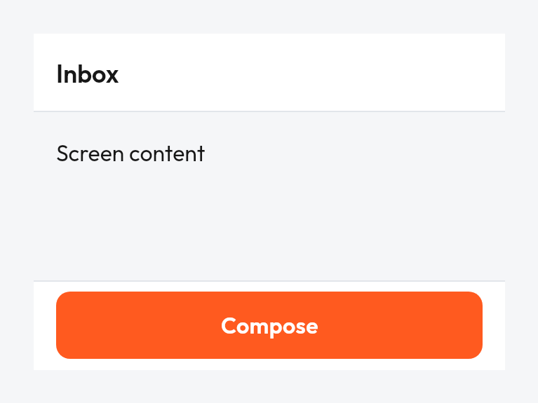
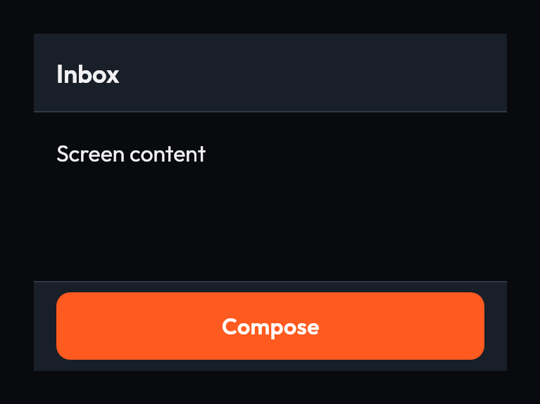 ScaffoldThe screen frame: top bar, bottom bar, snackbar host and inset-aware content.
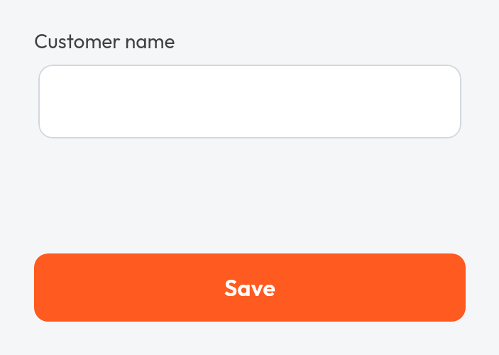
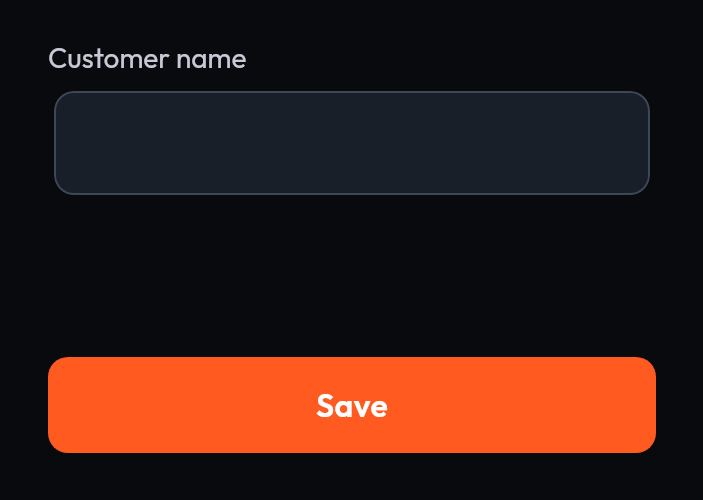 Form layoutA form whose bottom bar stays above the keyboard.
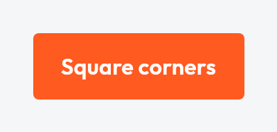
 Theme component stylesSet a component's look once in the theme; a value passed to a call still wins.
Patterns
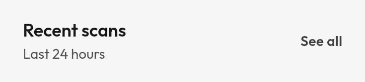
 Section headerA titled header with an optional action.
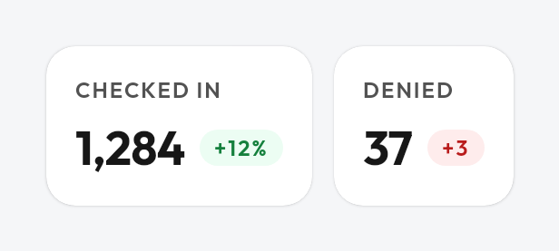
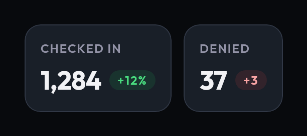 Stat cardA metric with a trend indicator.
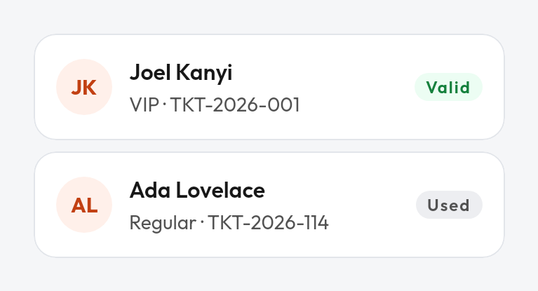
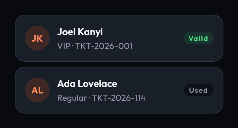 Ticket rowA named row with a status badge.
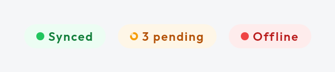
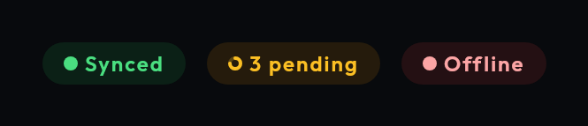 Status pillA compact status with an optional spinner.
Content blocks
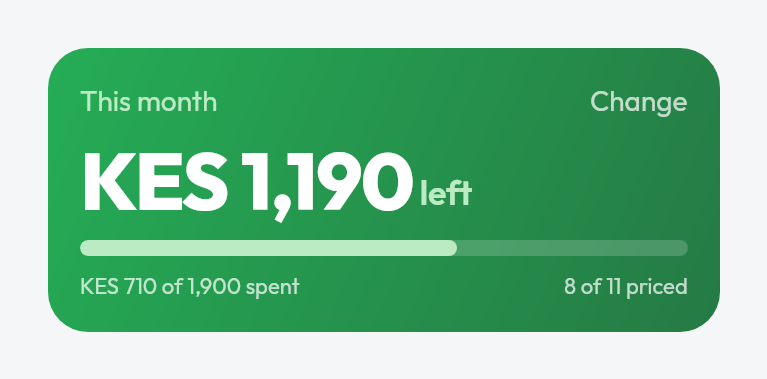
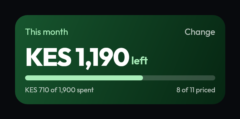 Verdict barA headline amount with progress and sublines.
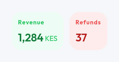
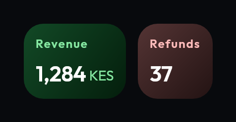 Stat tileA labelled metric with a unit and tone.
 StepperIncrements or decrements a bounded number.
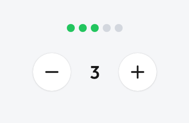
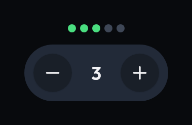 Dot stripProgress or paging shown as filled dots.

 Media heroA media header with a title and support line.
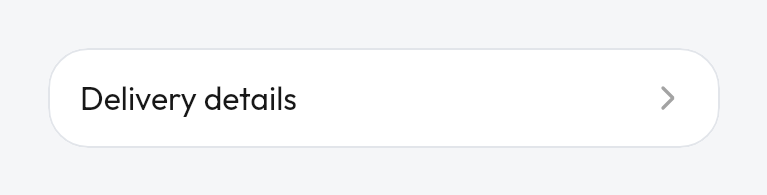
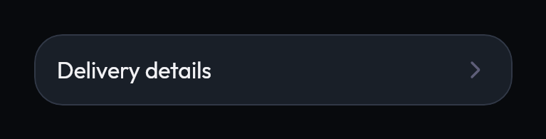 Expandable rowA card whose header reveals more content.

 Reaction barPositive and negative feedback actions.
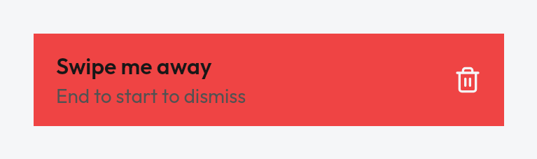
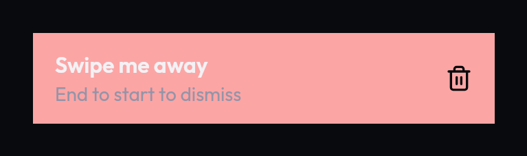 Swipe to dismissSwipe a row away to dismiss it.
Media
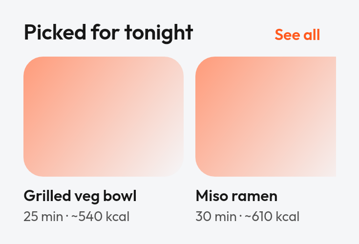
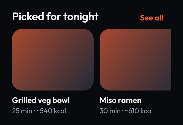 Image shelfA horizontal shelf of media cards.

 ImageA remote image, clipped to a shape, with a placeholder while it loads.
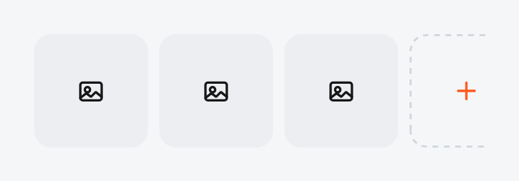
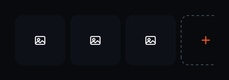 Thumbnail stripA row of square thumbnails with an add tile.

 Image viewerA full-screen viewer with zoom, for photos.
 Image viewer with pagesSwipe between several images, each zoomed on its own.
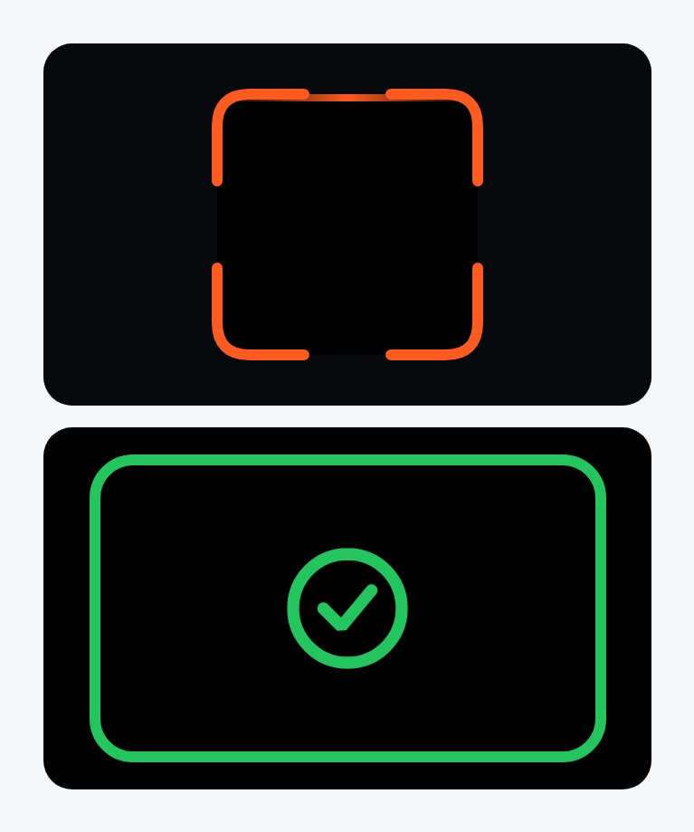
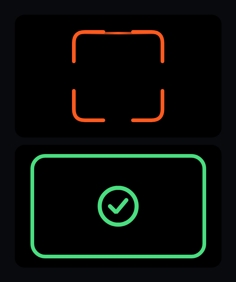 Scanner viewfinder
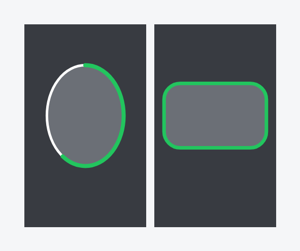
 Capture frame

 Shutter button